When I started my multimodal analysis draft, I was still thinking about it mostly as a paper. I knew I was analyzing a website, and I knew visual design mattered to my argument, but my instinct was still to write the analysis first and think about presentation afterward.
That changed while I was building the draft.
The more closely I examined the website, the harder it became to separate what it said from how it said it. Color, spacing, typography, hierarchy, images, and navigation were not decorations surrounding the site’s message. They were helping create that message. Once I recognized that, I also had to confront something slightly uncomfortable: the same standard applied to my own work.
If I was arguing that design choices shape meaning, then submitting pages of uninterrupted text with a few images dropped into them would undermine my own analysis.
That realization changed how I approached the draft.
I began thinking about where a reader’s eye would go first, which evidence needed to be seen rather than merely described, how much visual information belonged on a page, and when white space could do more than another sentence. Screenshots became evidence. Captions became part of the analysis. Placement created relationships between my claims and the visual examples supporting them.
Visual evidence
The draft, before and after
The same opening argument changes when hierarchy, proximity, typography, and white space become part of its delivery.
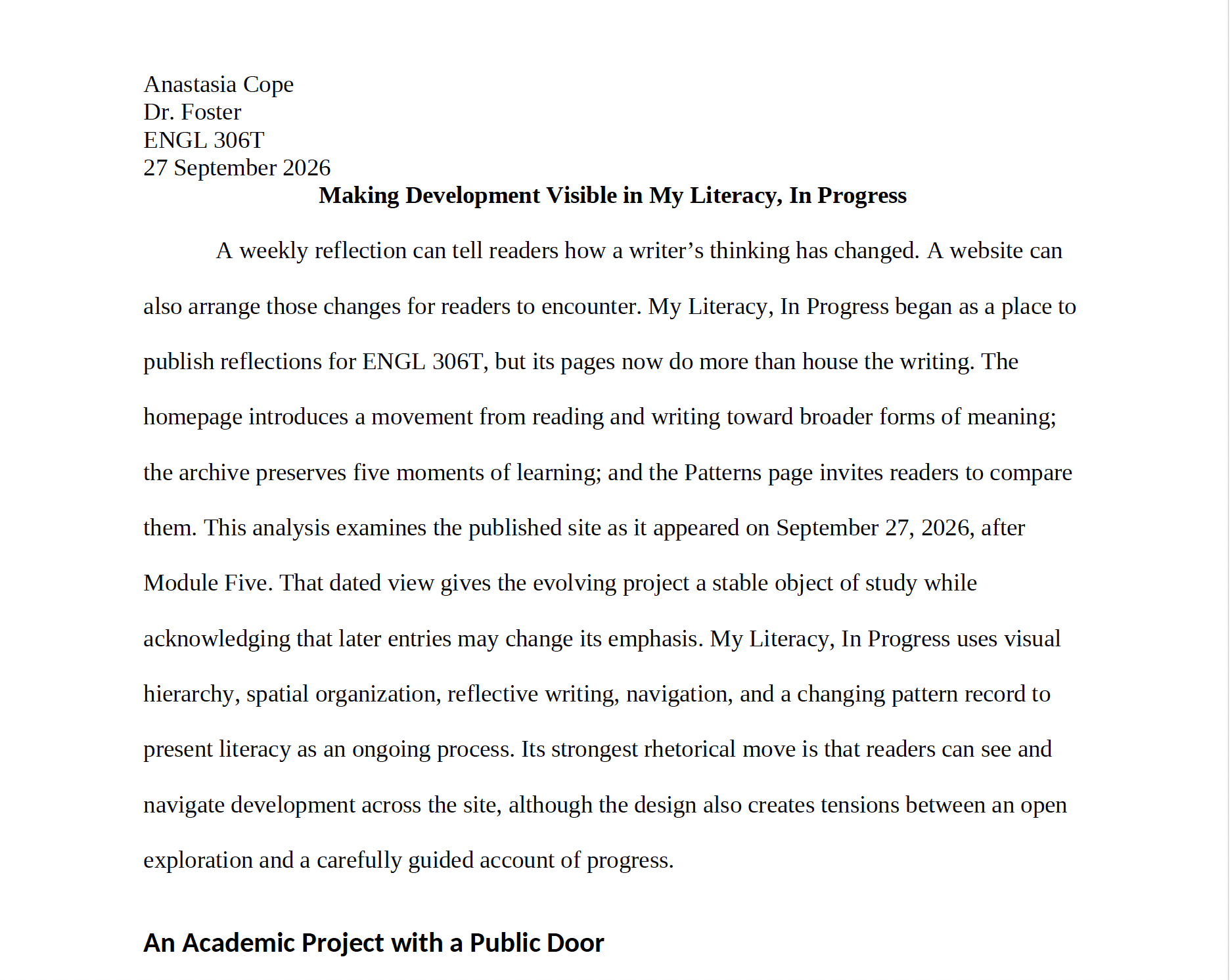
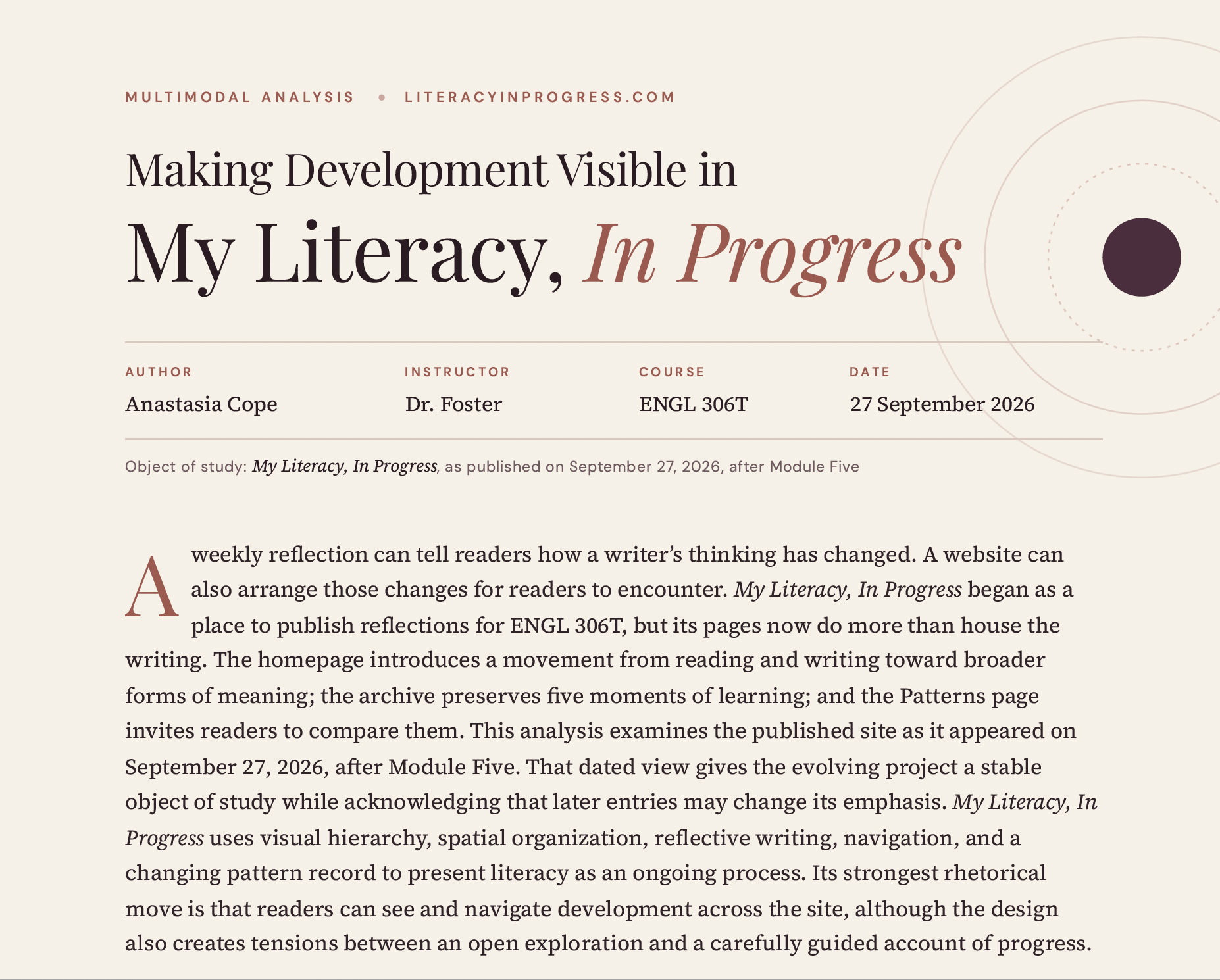
The process also made me more aware of something Writer/Designer emphasizes: the what and the how of a text cannot really be separated (Arola et al., 2014). I understood that concept before this assignment, but designing the analysis made it much more concrete. I could change the experience of the exact same argument simply by changing its presentation.
That does not mean more design is always better. If anything, this draft taught me the opposite. Every visual choice creates emphasis, whether I intend it to or not. Making something larger tells the reader it matters. Putting two elements together suggests a relationship. Creating space between sections signals a transition. Even leaving something out affects what the reader understands.
That makes multimodal writing feel less like adding visuals to writing and more like managing attention deliberately.
“The design and the argument are finally doing the same work.”
Looking back at my first draft and the version it became, the biggest change is not that the second one looks better. It is that the design and the argument are finally doing the same work.
I think that is the part of multimodal writing I am beginning to understand.
Reference
Arola, K. L., Sheppard, J., & Ball, C. E. (2014). Writer/designer: A guide to making multimodal projects. Bedford/St. Martin’s.